Your bullet journal deserves better than a sad horizontal line separating your sections. Bullet journal dividers are the secret weapon that turns a messy notebook into something you actually want to show off. Let’s get into the good stuff.
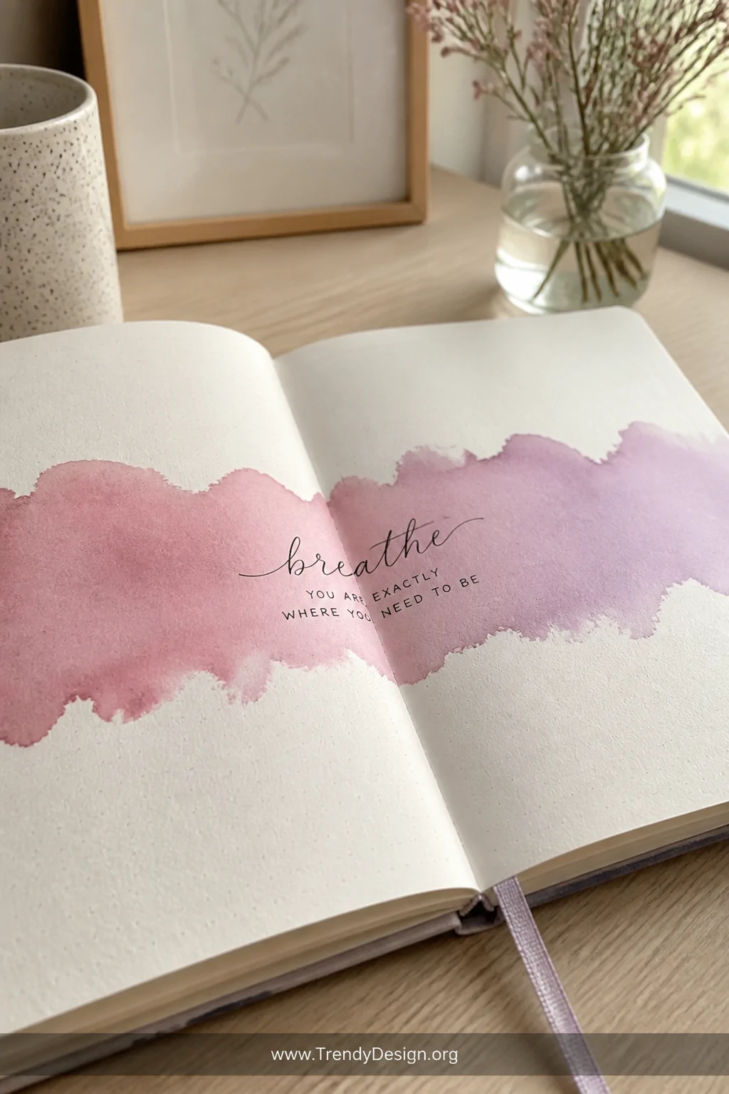
1. Watercolor Wash Dividers
As an Amazon Associate I earn from qualifying purchases.
Nothing says “I have my life together” like a soft watercolor stripe cutting across your page. Grab a wide brush, load it with your favorite color, and sweep it horizontally across the spread. Let it dry completely before writing over it patience is a virtue, especially here.
You don’t need to be an artist to pull this off. Even the most uneven, slightly-too-wet wash looks intentional and gorgeous. The imperfection is literally the point.
- Use two complementary colors and let them bleed together naturally
- Try a diagonal wash for a more dynamic, editorial feel
- Add a fine-liner title directly on top once dry
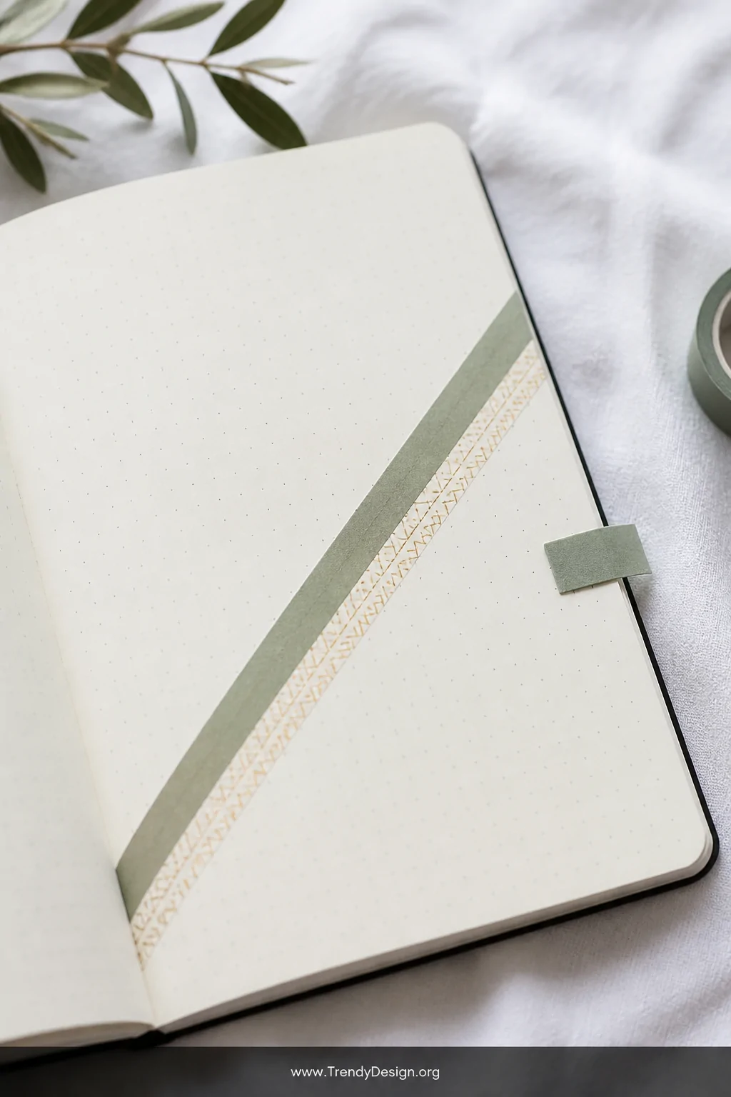
2. Washi Tape Borders and Bands
As an Amazon Associate I earn from qualifying purchases.
Washi tape dividers are the ultimate lazy-genius move, and honestly, we respect it. Tear a strip, press it down, done. The texture and pattern do all the decorative heavy lifting while you take full credit.
Layer two thin strips side by side for a more polished, intentional look. Mix a solid color with a patterned tape to create depth without any actual drawing skills required.
- Diagonal tape placement instantly adds energy to a flat page
- Use complementary tape widths for a structured, editorial feel
- Fold a tiny tab over the edge to create a functional page flag
FYI, washi tape also covers mistakes beautifully. That’s just a bonus.
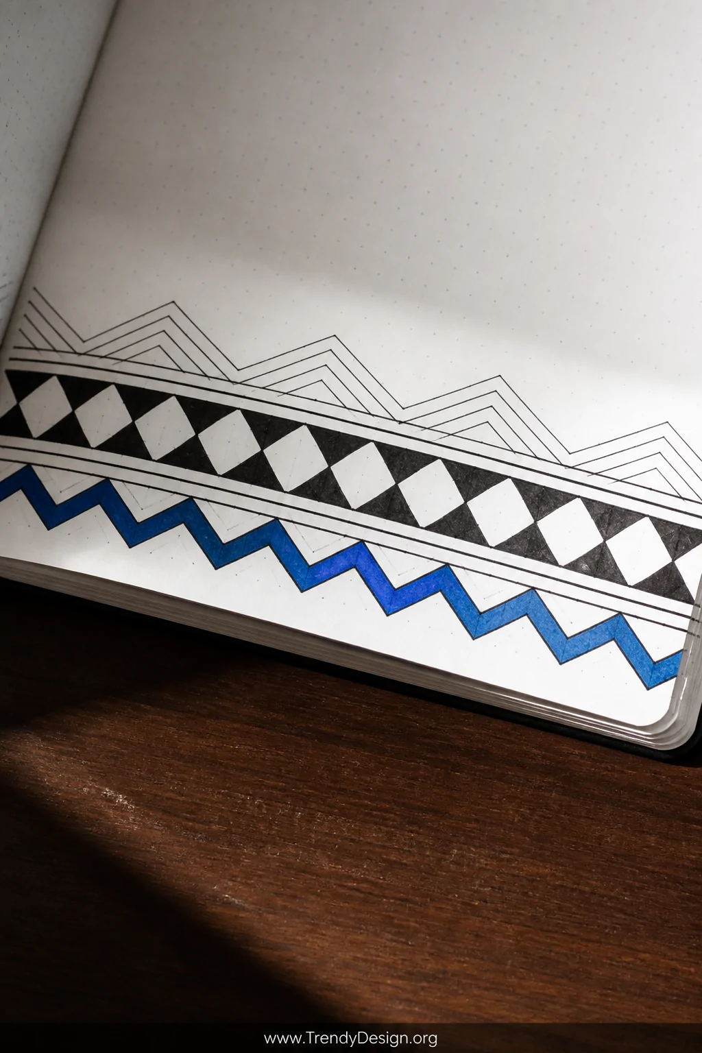
3. Geometric Line Dividers
As an Amazon Associate I earn from qualifying purchases.
Pick up a ruler and a fine-liner pen, because geometric divider designs are about to become your new obsession. Think triangles, zigzags, overlapping diamonds, or a clean series of parallel lines in graduating thicknesses. It’s graphic design energy on a notebook page.
The best part? You only need basic shapes. Repeat a simple triangle motif across the width of your page and suddenly your journal looks like it belongs in a design studio.
Quick Geometric Ideas to Try
- A row of tiny diamonds filled with alternating black and white
- Stacked chevron lines using just two parallel rulers
- A single bold zigzag with a contrasting color fill below it
- Interconnected hexagons forming a honeycomb band
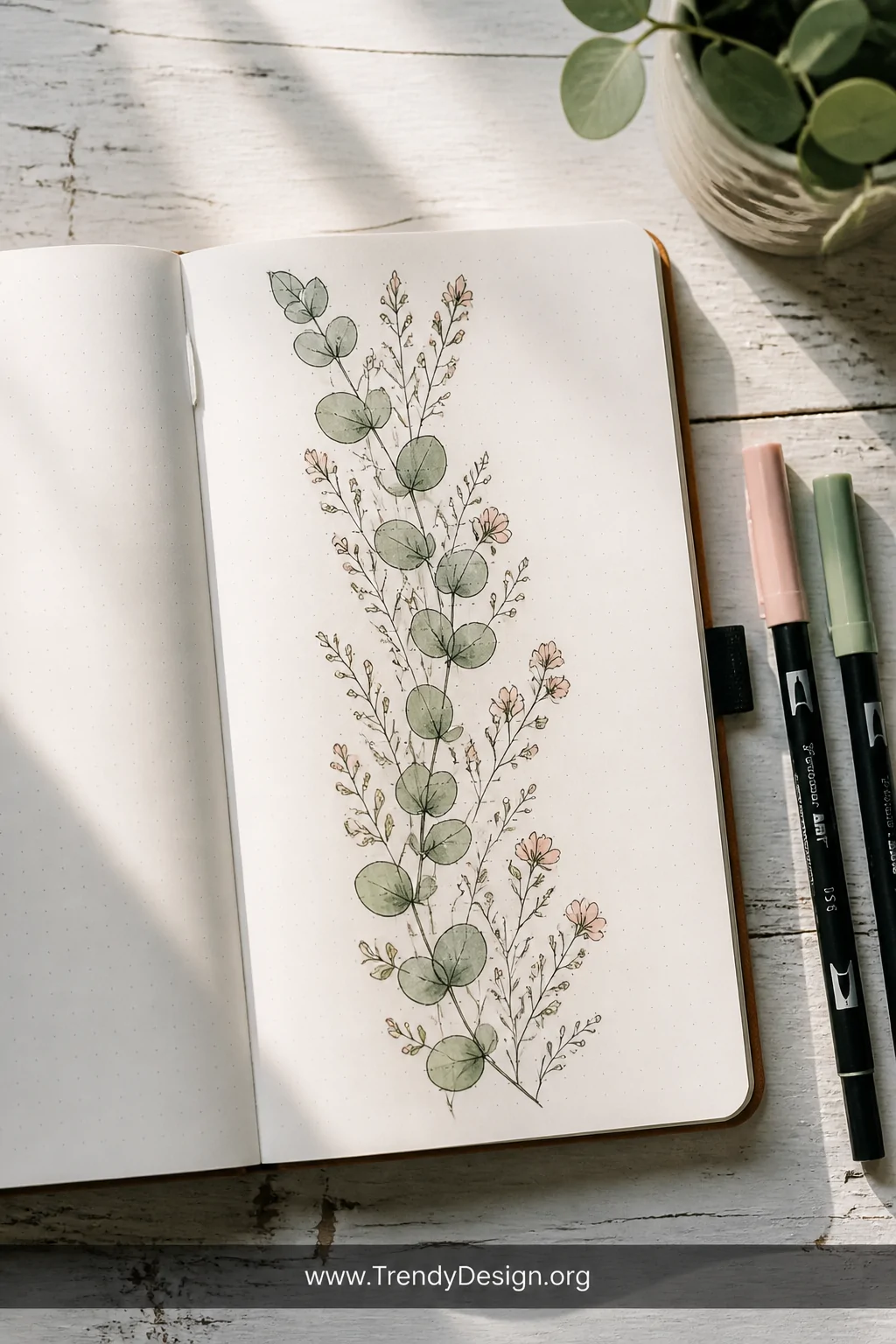
4. Botanical and Floral Strips
As an Amazon Associate I earn from qualifying purchases.
You don’t need to draw photorealistic roses to make floral bullet journal dividers work. Simple leaves, tiny daisies, or even abstract petal shapes strung across the page create the most beautiful, organic separators. Think of it as a little garden growing between your to-do lists.
Use a single ink color for a clean, cohesive look, or go full color with colored pencils and brush pens. Either way, the result feels fresh and personal in a way that printed planners just cannot compete with.
- A vine of alternating leaves works for any skill level
- Tiny wildflower clusters feel effortless and boho-chic
- Eucalyptus sprigs are forgiving, fast, and always stylish
5. Banner and Ribbon Dividers

As an Amazon Associate I earn from qualifying purchases.
Banner-style dividers pull double duty they separate your sections AND label them at the same time. Draw a simple ribbon shape, write the section title inside, and you’ve just created a functional design element that looks intentional and polished.
IMO, this is the smartest divider style in the whole lineup. You save time by combining decoration with organization in one stroke. Efficiency meets aesthetics, and your journal wins.
- Try a folded ribbon shape with a small triangular notch cut out of each end
- Stack two banners in different sizes for a layered header effect
- Use a pop of color fill to make the banner title jump off the page
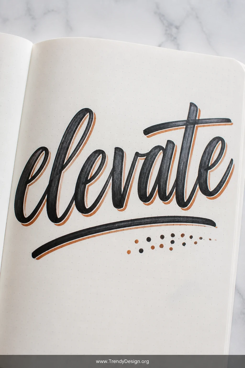
6. Brush Lettering Title Dividers
As an Amazon Associate I earn from qualifying purchases.
Sometimes the most striking creative journal dividers are pure typography. A beautifully hand-lettered section title, stretched wide across the page with a thin underline or shadow effect, can be just as visually impactful as any illustrated design.
Practice your brush lettering on scratch paper first, then commit to the page. Pair the lettering with a single decorative element a small star, a dot cluster, or a simple underline flourish to complete the look without overdoing it.
Lettering Styles That Work Beautifully
- Bold block letters with a drop shadow in a contrasting color
- Faux calligraphy with thick downstrokes and thin upstrokes
- Mixed caps lettering where every other letter alternates in size
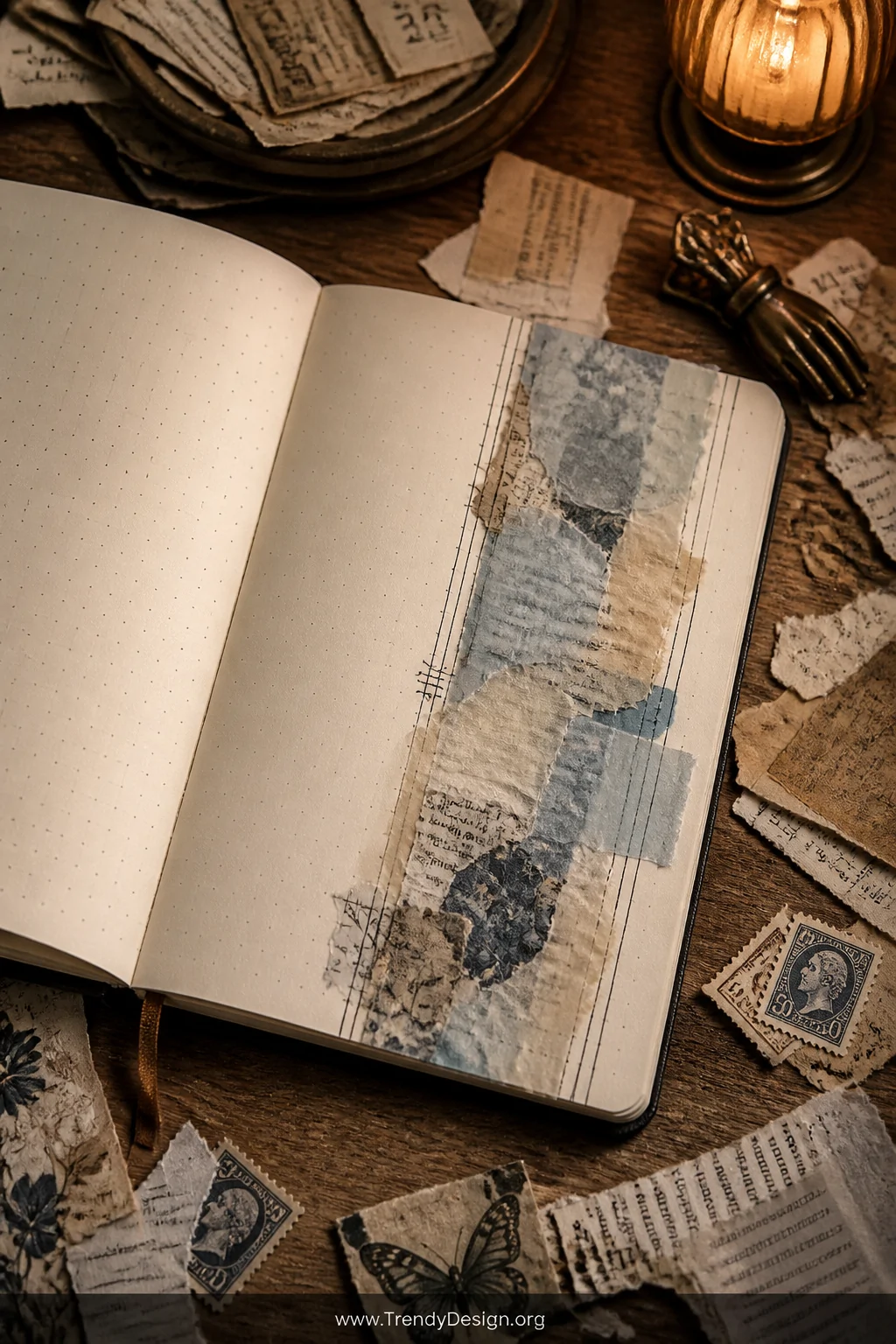
7. Collage and Ephemera Strips
As an Amazon Associate I earn from qualifying purchases.
Tear out tiny pieces of patterned paper, old book pages, magazine clippings, or decorative tissue paper and paste them across your spread as a divider. Collage-style dividers bring texture, personality, and a genuinely unique quality that no pen can fully replicate.
Overlap the pieces slightly and seal them with a thin layer of washi or matte medium so edges don’t peel. Then run a fine-liner over the top to add details or anchor the collage strip to the rest of your page design.
- Torn edges look more artsy than clean-cut edges every single time
- Vintage postage stamps make incredible narrow divider accents
- Layer translucent tissue paper over solid paper for a dreamy effect
- Combine collage with watercolor for a mixed-media masterpiece
Your bullet journal is a direct reflection of your creativity, and the dividers are where that creativity gets to play. Whether you go minimal with clean geometric lines or maximalist with full collage strips, the right bullet journal divider ideas completely transform how your spreads feel to flip through. Start with one style that excites you, experiment without pressure, and watch your pages go from functional to genuinely beautiful. You’ve got this.
Leave a Reply